CareEasy
A mobile app designed to help family members who care for their loved ones through tasks and expense management (Phase I).
- Shipped: March 2020 – Jan 2021 (Phase I: Beta Launch)
- Shipped: Jan 2021 – June 2021 (Phase II)
Background
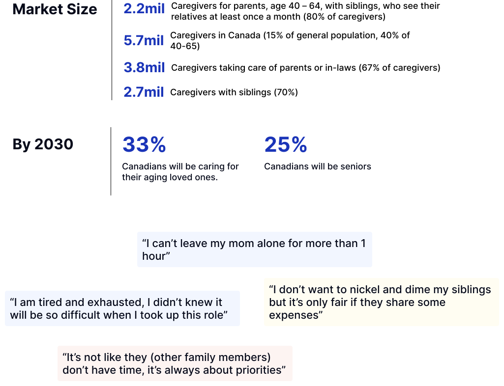
As the population of family caregivers increases (1 in 3 by 2030)*, CareEasy is on a mission to alleviate negative impact on family caregivers' health, career, and finance, by providing tools and resources in 3 phases: Coordination, Service booking, and Financial support.
*Source: Caregivers in Canada (Release in 2020). Statistics Canada.
Central Design Goals
Transparency
Alleviate task and expense share
Simple & Easy to use
My Role
- Ideated Phase 1 early stage product concept with founders
- Owned design task planning aligning with a product roadmap
- Ran user testing/research through collaboration with a researcher
- Led idea collaboration sessions with engineers, product managers, marketing and other designers
- Built product wireframe, flow chart and low-fidelity prototyping
- Executed visual app design and high-fidelity UI/UX
- Initiated and created animation work for intro screens through Illustrator and After effects
- Ran pre & post-launch app testing and audit
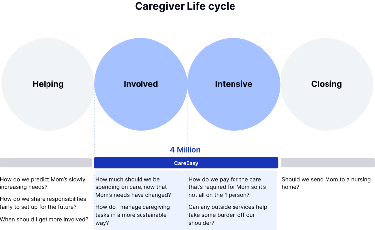
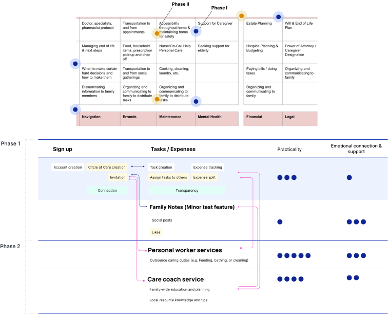
Product Roll-out Phases and User Journey
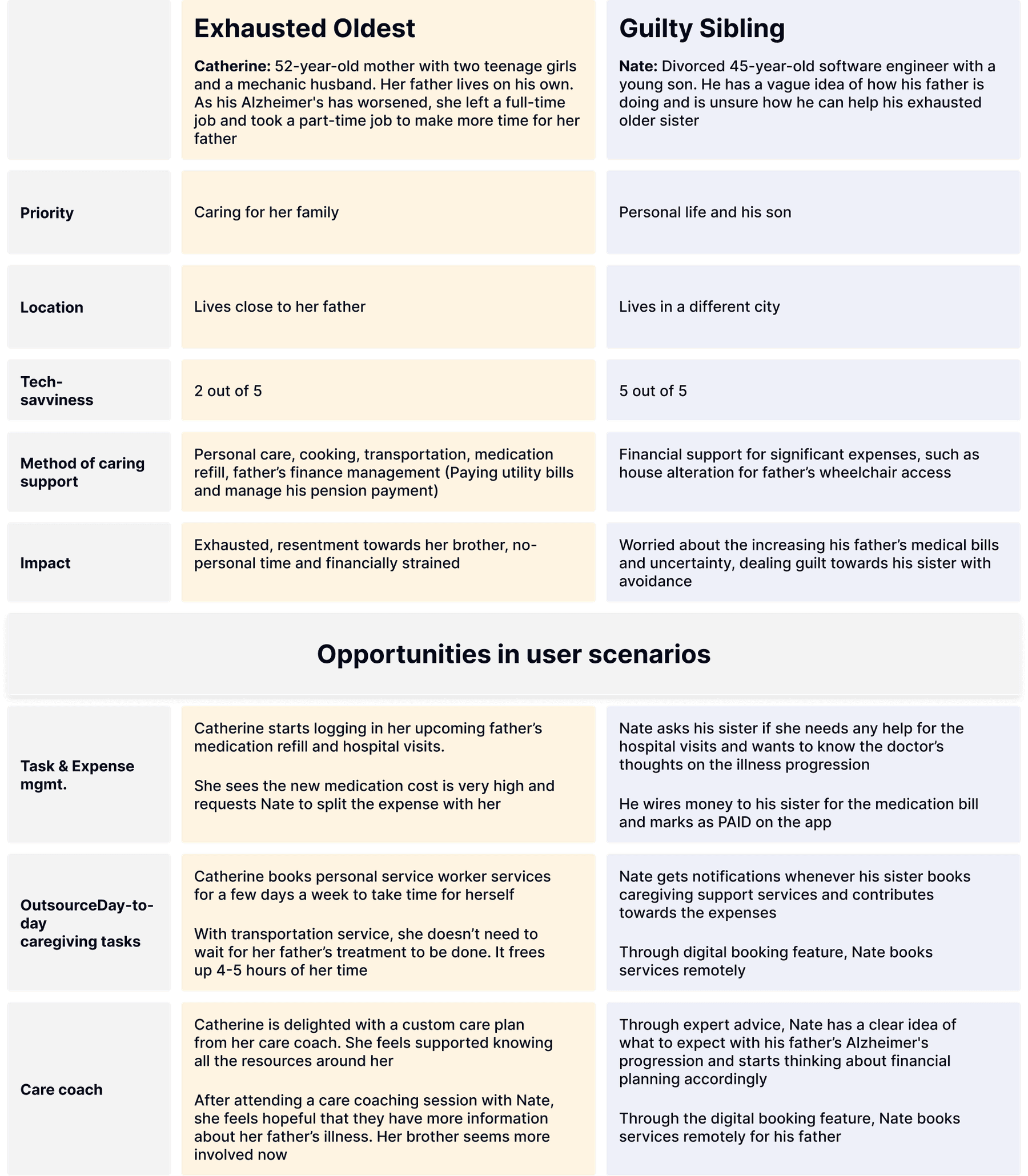
User Personas and Opportunities
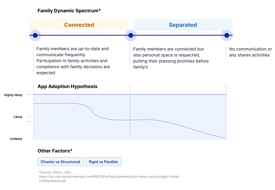
Family Dynamics
Since this app is meant to be used with at least two Circle members, the family dynamics has impact on app user engagement and retention.
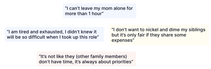
“Although my younger sister lives with our parents, she doesn't care for them. All caring responsibilities fall on my lap.”
“All my siblings have good jobs, but some of them do not contribute to medical bills. I don't know why.”
Family Dynamics and Impact on App Adoption
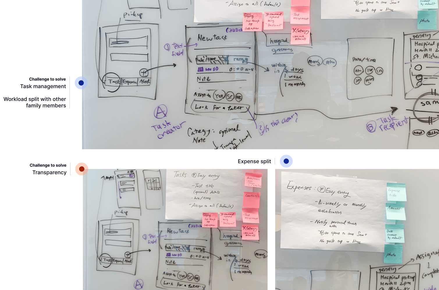
Early Stage White Boarding Session
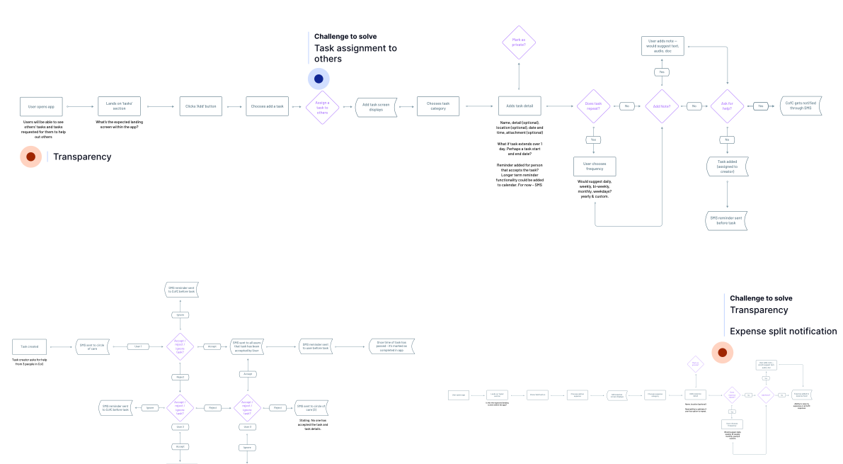
Product Flow
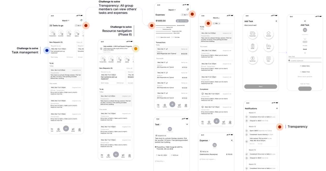
Concept Wireframe (I)
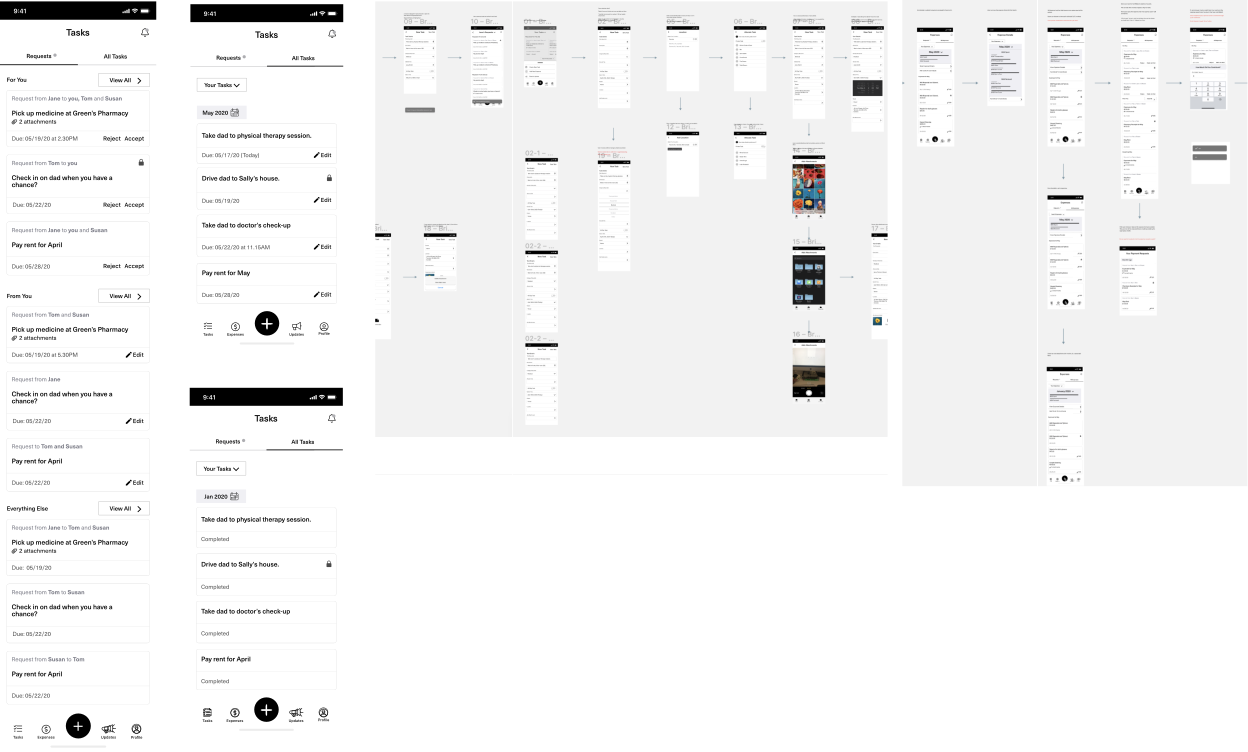
Wireframe (II)
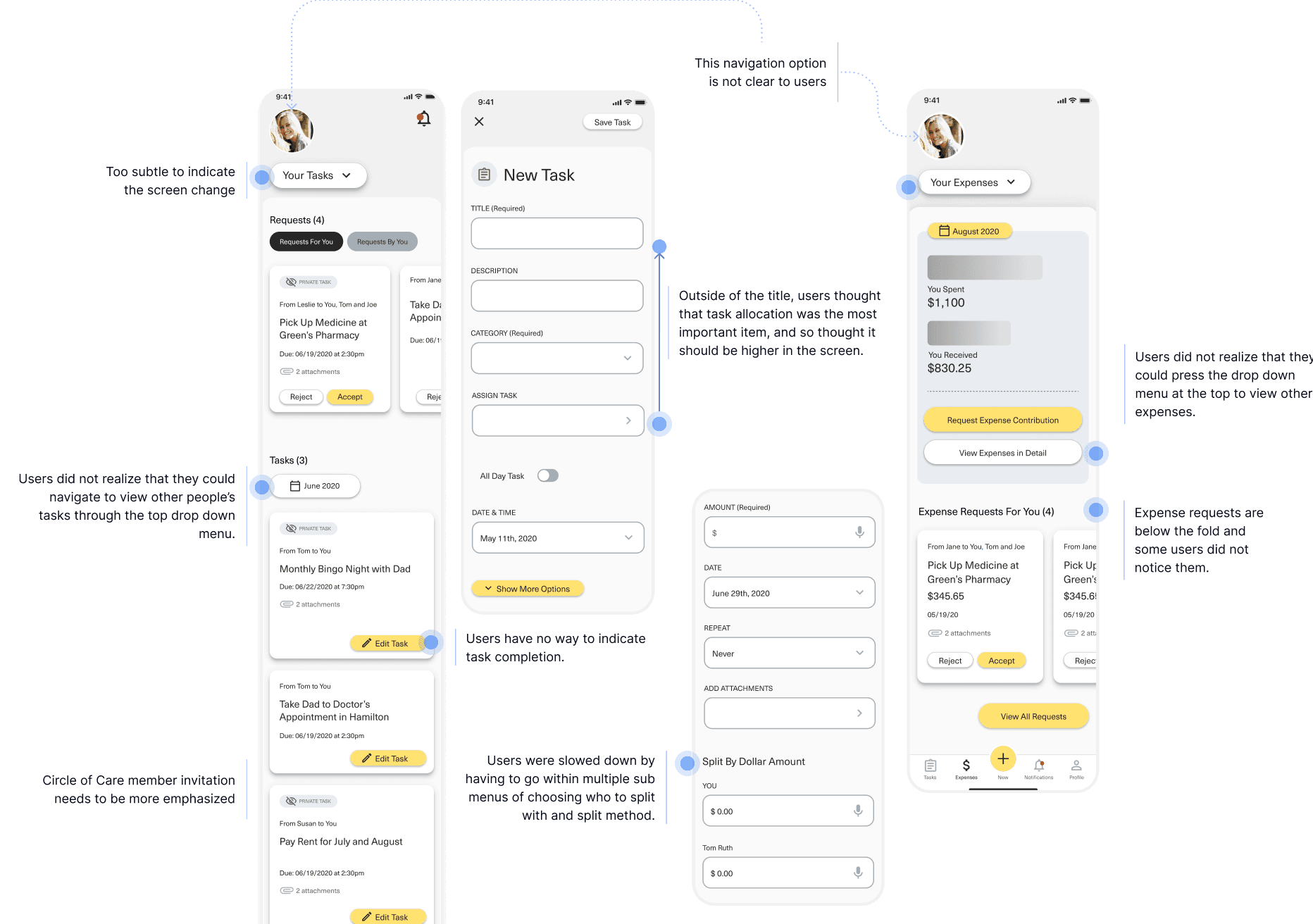
User Testing Findings
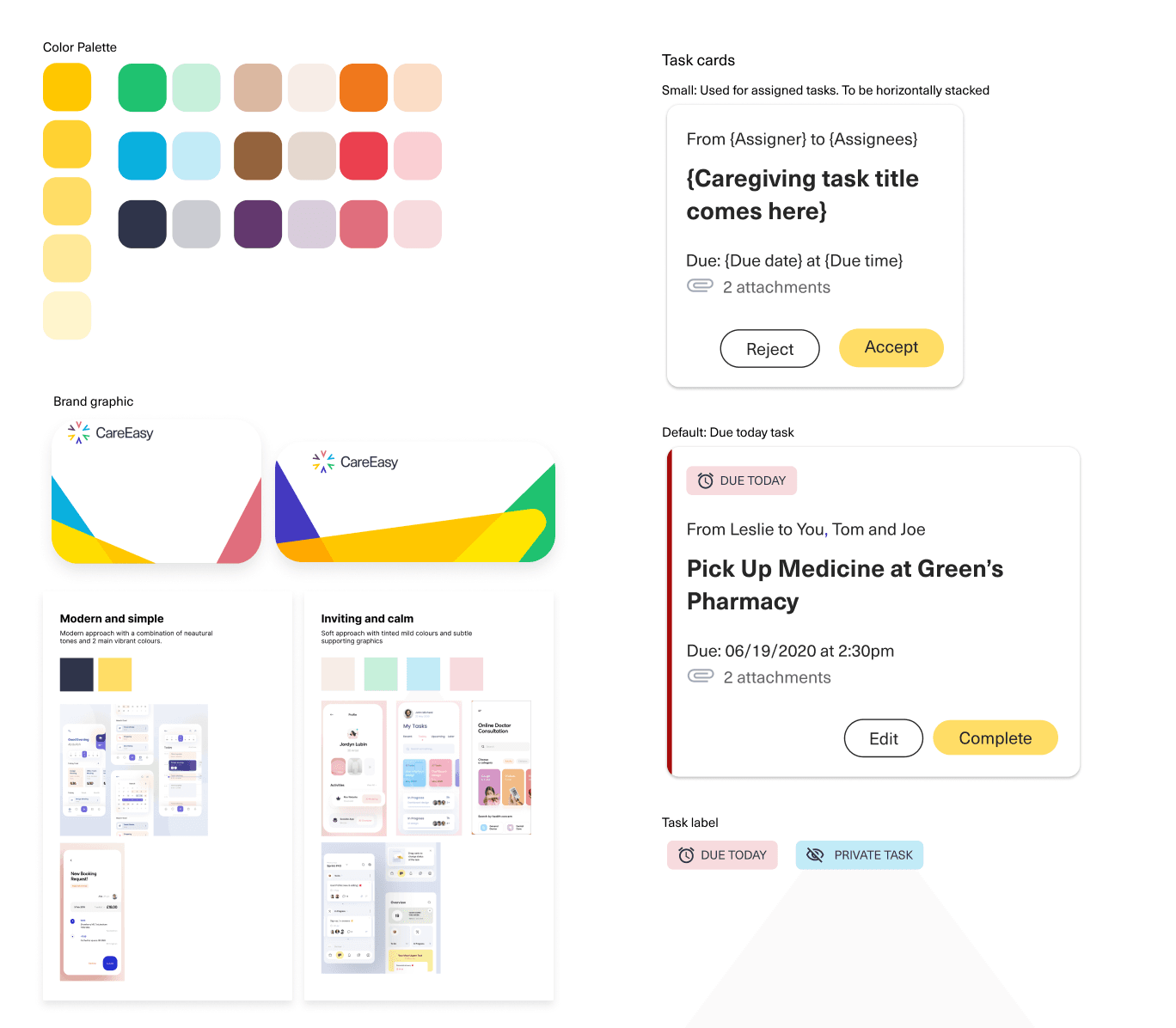
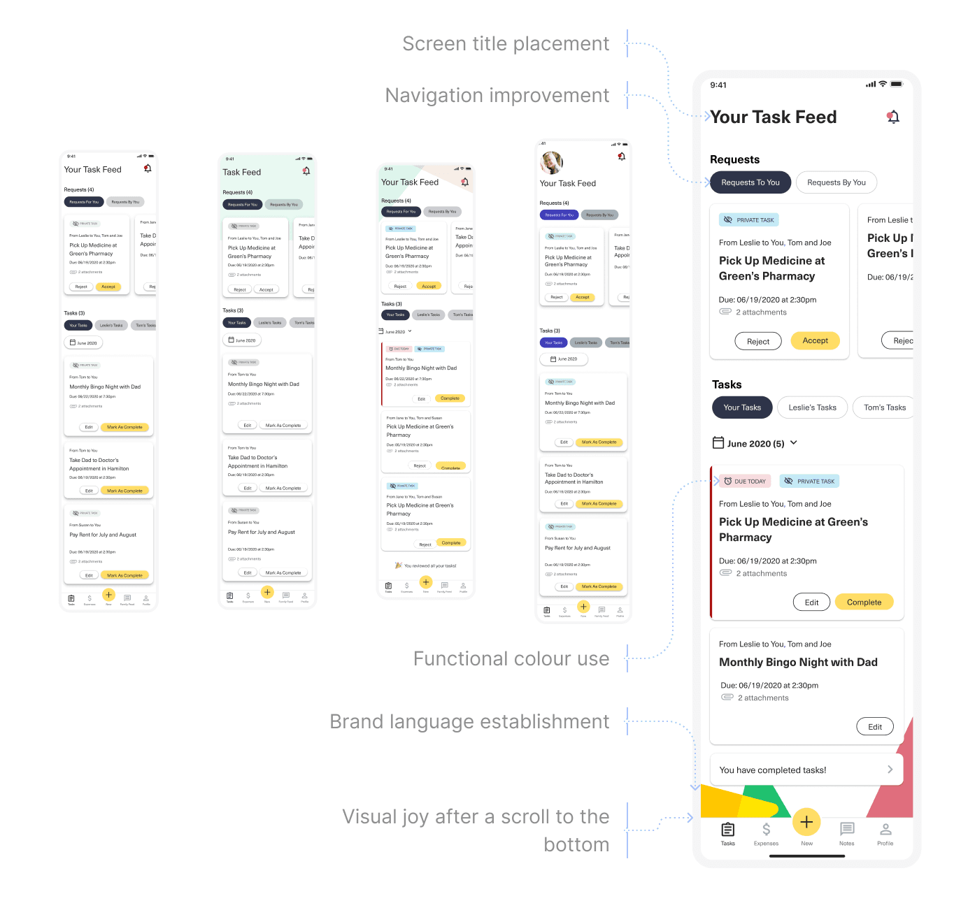
High-fidelity Design and Visual Direction
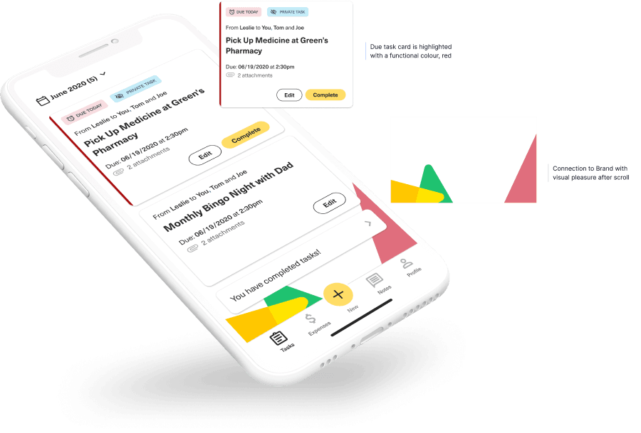
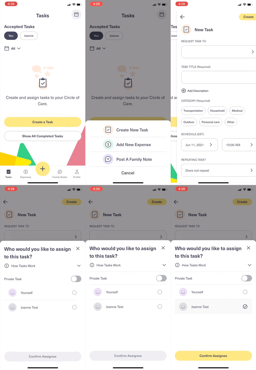
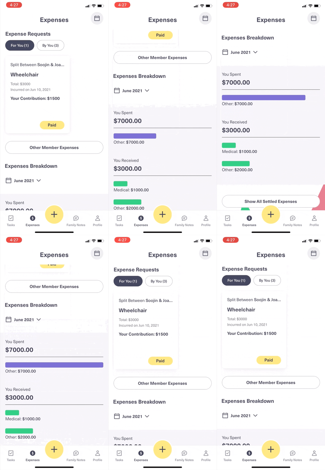
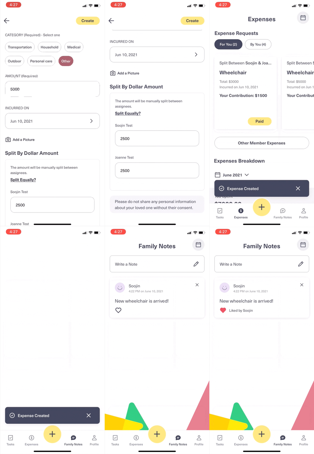
App in action
Post-Launch evaluation for improvement opportunities
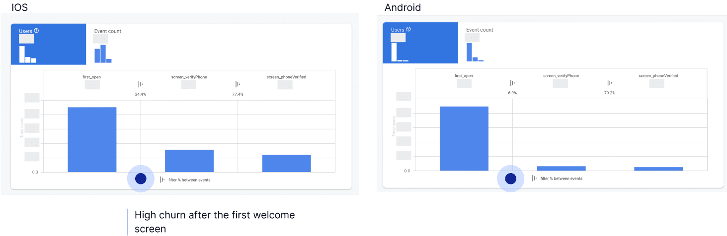
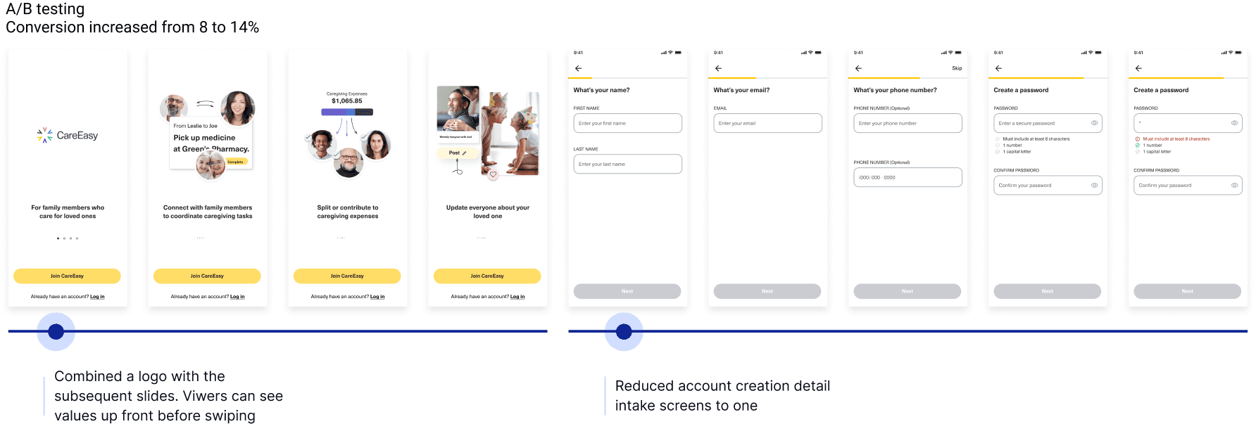
To lay a foundation for long-term engagement and stickiness, we prioritized high-friction areas in the user onboarding and member invitation flows.
- The Problem: Analytics showed a drastic user drop-off immediately after the initial sign-up screen, as users perceived the multi-step process as too long.
- The Hypothesis & Execution: We consolidated a 5-step onboarding flow into a single, streamlined screen to reduce cognitive load and capture user intent earlier.
- The Impact: +6% increase in sign-up conversion rate.